Difference between pages "Evaluation Notes - Creating Original Art" and "Selection + crop tool specification"
(→Image window issues) |
(→fixed width/height/size) |
||
| Line 1: | Line 1: | ||
| − | == | + | ==intro== |
| − | |||
| − | + | This is the specification for the rectangle + oval selection, and the | |
| − | + | crop tools. It is based on the state of GIMP 2.3.13, and is now updated with the realities of 2.3.18. | |
| − | == | + | ==on units, sizes and visible== |
| − | |||
| − | |||
| − | |||
| − | |||
| − | |||
| − | |||
| − | |||
| − | + | All sizes in this spec are in '''on-screen pixels'''. This means that the zoom level has an influence on everything. A 30x20 in-image rectangle can be displayed on screen as 300x200, and vice versa. | |
| − | + | Also the panning of the image has an influence on everything. Only the visible part of the bounding rectangle goes into the size calculations. Example: a 123x45 image rectangle is viewed at 1000%, only the left-most 2/3rd and top half of the rectangle is visible in the image window: 820x225 on-screen pixels go into the calculations ( 123*10*2/3 and 45*10/2). | |
| − | |||
| − | == | + | ===decision time=== |
| − | |||
| − | |||
| − | |||
| − | |||
| − | |||
| − | |||
| − | + | The right moment to recalculate handle sizes and decide if there is a narrow situation shall be '''after''' through zooming, panning or actual bounding rectangle size change, the on-screen pixel size of the bounding rectangle has changed. It is explicitly '''not''' desirable to do this during zooming, panning or actual bounding rectangle size change. | |
| − | |||
| − | == | + | ==handling the bounding rectangle on the canvas== |
| − | |||
| − | |||
| − | |||
| − | |||
| − | |||
| − | |||
| − | == | + | ===pending=== |
| − | |||
| − | |||
| − | |||
| − | |||
| − | |||
| − | |||
| − | |||
| − | + | Between being created and being committed (by means of a single mouse click in its area or the enter/return key), a rectangle is called to be in pending state. | |
| − | |||
| − | + | The algorithm for the size of the corner handles (handle height = bounding rectangle height / 4, CLAMPed by 6 and 50, handle width = bounding rectangle width / 4, CLAMPed by 6 and 50) allows fast interaction: | |
| − | + | [[image:2.4_basic_corners.png]] | |
| − | + | what is black in this image shall be rendered inverted on the canvas. ''note that at any time the marching ants of a selection edge can obscure an inverted line.'' | |
| − | + | Each corner handle shall enable users to resize the bounding rectangle by dragging one of them, where the diagonally opposite corner of the bounding rectangle shall be the anchor point. | |
| − | |||
| − | |||
| − | |||
| + | The rectangle cornered by the corner handles shall be the move handle: one big handle where users shall be able to move the bounding rectangle around the canvas by initiating a drag in this handle: | ||
| − | + | [[image:2.4_move_area.png]] | |
| + | ''the gray area shown here is purely for illustration in this spec and shall not be rendered in GIMP'' | ||
| + | Areas between two adjacent corner handles are called side handles. | ||
| − | + | The height of the two horizontal side handles shall be exactly the corner handle height, and their width shall be the (bounding rectangle width - 3 * corner handle width), CLAMPed on the lower side by 6. | |
| − | + | The width of the two vertical side handles shall be exactly the corner handle width, and their height shall be the (bounding rectangle height - 3 * corner handle height), CLAMPed on the lower side by 6. | |
| − | |||
| − | + | All side handles shall be exactly centred on the side they are attached to. If the side of the of the bounding rectangle is an odd number of pixels long, then the attached side handle shall be an odd number of pixels long. Similarly: if even, then even. When this adjustment is needed, it shall be done by increasing the handle size by one pixel. | |
| − | + | [[image:2.4_side_handles.png]] | |
| − | |||
| − | |||
| − | |||
| − | |||
| − | |||
| − | |||
| − | |||
| − | |||
| − | + | ''the gray area shown here is purely for illustration in this spec and shall not be rendered in GIMP'' | |
| − | + | This all makes the size of the side handles predictable (and thus faster to use each time) where it counts most (their smallest dimension) and uses their largest dimension to leave a gap to reach the corner handles from within. | |
| − | + | Each side handle shall enable users to resize the bounding rectangle by dragging one of them, moving the side it is attached to, where the mid-point of the opposite side of the bounding rectangle shall be the anchor point. | |
| − | + | What is left within the bounding rectangle are the dead areas, a drag by users starting in these shall do nothing, neither move, nor resize. This is to prevent accidental move when trying to resize, or accidental resize when trying to move: | |
| − | |||
| − | |||
| − | |||
| − | |||
| − | |||
| − | |||
| − | |||
| − | |||
| − | + | [[image:2.4_dead_areas.png]] | |
| − | |||
| − | |||
| − | |||
| − | + | ''the gray area shown here is purely for illustration in this spec and shall not be rendered in GIMP'' | |
| − | |||
| − | |||
| − | + | In the implementation the dead areas shall be used as ‘bumpers’ to reconcile the rounding-off effects in the sizes of the corner and side handles. The dead areas are simply what is left over in area of the bounding rectangle. | |
| − | + | ====fixed width/height/size==== | |
| − | |||
| − | === | ||
| − | |||
| − | |||
| − | |||
| − | |||
| − | + | When users are enforcing fixed width or height in the pending state, the rectangle handles shall reflect this. Showing corner handles does not make sense, because only two of the sides can be adjusted. Therefore these two side handles shall be displayed (fixed height, left; fixed width, right): | |
| − | |||
| − | |||
| − | |||
| − | |||
| − | |||
| − | |||
| − | |||
| − | |||
| − | |||
| − | + | [[image:2.4_constant_wh_handles.png]] | |
| − | + | With no corner handles to compete with, the side handles shall occupy the whole side of the bounding rectangle. The height | |
| + | of the top and bottom handles and the width of the left and right handles shall be calculated as usual. The rest of the bounding rectangle area shall be the move handle: | ||
| − | + | [[image:2.4_constant_wh_move.png]] | |
| − | |||
| − | |||
| − | |||
| − | + | ''the gray area shown here is purely for illustration in this spec and shall not be rendered in GIMP'' | |
| − | + | When users are enforcing fixed size in the pending state, the rectangle handles shall reflect this. Showing corner handles does not make sense. The whole bounding rectangle area shall be one big move handle: | |
| − | + | [[image:2.4_constant_size_no_handles.png]] | |
| − | |||
| − | |||
| − | |||
| − | + | ''the gray area shown here is purely for illustration in this spec and shall not be rendered in GIMP'' | |
| − | |||
| − | |||
| − | === | + | ===highlighting=== |
| − | + | When the sprite (mouse cursor) hovers over a corner handle, it shall highlight by inwardly doubling its perimeter line, and by hiding the other 3 corner handles: | |
| − | + | [[image:2.4_corner_highlight.png]] | |
| − | + | When the sprite hovers over a side handle, it shall highlight along the whole side of the bounding rectangle with a 1-pixel line, to communicate that it moves the side. The other dimension of the highlight rectangle shall be that of the corresponding side handle. Also there shall be a 2-pixel line along the perimeter of the side handle itself. This is important because this is the only opportunity we have to communicate the size of the handle in a non-obstructive way. The two corner handles on the opposite side shall be hidden: | |
| − | + | [[image:2.4_side_handles_highlight.png]] | |
| − | |||
| − | |||
| + | ====fixed width/height==== | ||
| − | + | As an implication of enforcing fixed width or height in the pending state, the side handles shall highlight as shown here: | |
| − | + | [[image:2.4_constant_wh_highlight.png]] | |
| − | + | ===rubber-banding=== | |
| − | + | When the mouse goes down inside a corner handle and dragging commences, it shall be displayed and the other 3 hidden, to achieve a minimal-obstruction display: | |
| − | + | [[image:2.4_corner_drag.png]] | |
| − | + | When the mouse goes down inside a side handle and dragging commences, it shall display a rectangle along the whole side of the bounding rectangle with a 1-pixel line. The other dimension of this rectangle shall be that of the corresponding side handle. The two corner handles on the opposite side shall be hidden: | |
| − | + | [[image:2.4_side_handles_drag.png]] | |
| − | + | Corner handles shall '''not''' change in size during the rubber-banding of the size of the bounding rectangle. This is necessary to achieve a stable cause-and-effect relationship between the position of the sprite, and the size of the bounding rectangle. | |
| + | * Side handles shall track the dimension of the bounding rectangle on the side aligned with it, while the other side shall '''not''' change in size during the rubber-banding; | ||
| + | * On creation of a new rectangle, the handle size shall be the minimal handle size; | ||
| + | * When either side of a corner handle, or the not-bounding-rectangle-aligned side of a side handle, is equal or greater that the corresponding side of the bounding rectangle, the handle shall not be displayed during rubber-banding. | ||
| − | + | ==cursor keys== | |
| − | + | The most important thing about enabling cursor keys for moving/resizing the bounding rectangle is that it shall be exactly the same ''user experience'' as performing the same operation with a mouse click. The only exception to this is that when resizing due to a cursor key press, the rubber-banding display shall be skipped. | |
| − | |||
| − | + | * When the mouse is over one of the corner or side handles, and one of the up/down/right/left cursor keys is pressed, the rectangle shall be resized by one (shift: 15) '''image''' pixel in that direction. | |
| − | + | * When the mouse is over the move handle, and one of the up/down/right/left cursor keys is pressed, the rectangle shall be moved by one (shift: 15) '''image''' pixel in that direction. | |
| − | + | This interaction is not complete until the goal of keeping the sprite stable on the handle has been achieved. We depend on bug #362915 to be fixed, then we can explore feasible solutions. | |
| − | |||
| − | === | + | ==think small== |
| − | |||
| − | + | Both corner and side handles have a minimum size of 6 pixels. This will work for bounding rectangles down to a size of 18 pixels. Here we see rectangles with one and two dimensions of 18 pixels, also showing the side handles: | |
| − | |||
| − | + | [[image:2.4_mini_sizes.png]] | |
| − | |||
| − | |||
| − | |||
| − | + | ''the gray area shown here is purely for illustration in this spec and shall not be rendered in GIMP'' | |
| − | |||
| − | + | If the size of one of the sides of the bounding rectangle is below 18 pixels, we have a '''narrow situation'''. This can be caused by actually narrow-sized bounding rectangles, but also by zooming out and panning out of view. The obvious work-arounds for this (zoom in, pan in) are productivity eaters, we need a real solution. | |
| − | + | Move the handles outside. Here we see rectangles with one and two dimensions of 17 pixels: | |
| − | |||
| − | + | [[image:2.4_maxi_narrow.png]] | |
| − | |||
| − | + | In a narrow situation, the following specs change: | |
| − | |||
| − | + | * The corner handle size shall be 15x15 pixels, always. | |
| − | + | * If the the bounding rectangle has a non-narrow side, the long side of the side handle shall be (bounding rectangle side length - 2 * 15), CLAMPed on the lower side by 18, the short side of the side handle shall be 15 pixels. | |
| + | * On the narrow sides, the size handles shall simply fill the space between the two corner handles: | ||
| − | + | [[image:2.4_narrow_side_handles.png]] | |
| − | |||
| − | + | ''the gray area shown here is purely for illustration in this spec and shall not be rendered in GIMP'' | |
| − | |||
| − | |||
| − | |||
| − | + | There shall be only dead areas on a non-narrow side: | |
| − | |||
| − | |||
| − | |||
| − | + | [[image:2.4_narrow_dead_areas.png]] | |
| − | |||
| − | |||
| − | |||
| − | |||
| − | + | ''the gray area shown here is purely for illustration in this spec and shall not be rendered in GIMP'' | |
| − | |||
| − | + | The move handle shall be equal to the bounding rectangle: | |
| − | |||
| − | |||
| − | |||
| − | + | [[image:2.4_narrow_move_handle.png]] | |
| − | |||
| − | |||
| − | + | ''the gray area shown here is purely for illustration in this spec and shall not be rendered in GIMP'' | |
| − | |||
| − | + | Highlighting is unchanged: | |
| − | |||
| − | |||
| − | |||
| − | + | [[image:2.4_narrow_highlight.png]] | |
| − | |||
| − | |||
| − | + | As is dragging: | |
| − | |||
| − | + | [[image:2.4_narrow_drag.png]] | |
| − | |||
| − | == | + | ==interaction with the canvas edge== |
| − | |||
| − | |||
| − | |||
| − | |||
| − | + | In general it shall be possible to start a crop/selection rectangle outside the canvas, or to take the edges of the bounding rectangle outside the canvas. Below is specified what happens in these cases: | |
| − | |||
| − | |||
| − | |||
| − | |||
| − | == | + | ===selection tools=== |
| − | + | ||
| − | + | When one or more edges of the bounding rectangle is outside the canvas, then the canvas edge shall clip the effective selection. The interaction shall reflect this by showing the bounding rectangle in whatever size and position that users take it and the effective selection marching ants along the canvas edge where clipped. Especially with the elliptic select tool, this is part of creative workflow. | |
| − | === | + | |
| − | + | ''However:'' | |
| − | + | ||
| − | + | * If users enforce a fixed ratio of the bounding rectangle and one or more edges of the bounding rectangle is outside the canvas, then all of these edges shall be aligned with the corresponding canvas edges, and the from the resulting new bounding rectangle sizes the ratio enforcement shall be calculated. The interaction shall reflect this by showing the bounding rectangle in the newly calculated position; | |
| − | == | + | * If users enforce a fixed width of the bounding rectangle and the left or right edge of the bounding rectangle is outside the canvas, then this edge shall be aligned with the corresponding canvas edges, and the from the resulting new bounding rectangle sizes the width enforcement shall be calculated. The interaction shall reflect this by showing the bounding rectangle in the newly calculated position; if the fixed width is greater than the actual canvas width, then the full width of the canvas shall be used; |
| − | + | * If users enforce a fixed height of the bounding rectangle and the top or bottom edge of the bounding rectangle is outside the canvas, then this edge shall be aligned with the corresponding canvas edges, and the from the resulting new bounding rectangle sizes the height enforcement shall be calculated. The interaction shall reflect this by showing the bounding rectangle in the newly calculated position; if the fixed height is greater than the actual canvas height, then the full height of the canvas shall be used; | |
| − | + | ||
| − | === | + | ===crop tool=== |
| − | + | ||
| − | + | When the 'allow growing' option has been invoked by users, then the crop tool shall be in no way limited by the canvas or layer edge. In the other case: | |
| − | + | ||
| − | + | When one or more edges of the bounding rectangle is outside the canvas, then all of these edges shall be aligned with the corresponding canvas edges. The interaction shall reflect this by showing the bounding rectangle in the newly aligned position. | |
| − | + | ||
| − | # | + | For fixed ratio/width/height: see selection tools above. |
| − | #( | + | |
| − | + | If the 'Current layer only' option has been invoked by users, then all all behaviour specified above shall apply, substituting the layer (edge) for the canvas (edge). | |
| − | + | ||
| − | + | ==the fixed ratio/widht/height/size and the shift key== | |
| − | + | ||
| − | + | Between the 'Expand from centre' and Highlight checkbox there shall be the Fixed ratio/width/height/size control: | |
| − | === | + | |
| − | + | [[Image:2.4_constant_ratio_control.png]] | |
| − | === | + | |
| − | + | It is a checkbox, with ('''new''') a pop-up list in the first row, combined with a single textfield and two icons (portrait; landscape) in the second row. The pop-up list shall contain the items 'Aspect ratio', Width, Height, Size, in that order. The default shall be 'Aspect ratio'. | |
| − | === | + | |
| − | + | The width and height modes shall not display the icons: | |
| − | === | + | |
| − | + | [[Image:2.4_constant_wh_controls.png]] | |
| − | === | + | |
| − | + | The size mode is most identical to the ratio mode: | |
| + | |||
| + | [[image:2.4_constant_size_controls.png]] | ||
| + | |||
| + | ===textfield input=== | ||
| + | |||
| + | It is extremely important that the textfield shall be a single textfield with no up/down arrows. This allows for quicker input. | ||
| + | |||
| + | * in ratio mode, the textfield shall accept the formats A/B and A:B, where A and B are two floating point numbers; | ||
| + | * in width and height modes, the textfield shall accept a single floating point number; | ||
| + | * in size mode, the textfield shall accept the formats A*B, AXB and AxB, where A and B are two floating point numbers. A shall be the width, B shall be the height. | ||
| + | |||
| + | Before parsing the input, all white space characters shall be stripped out. The input shall be committed by a <return>, <enter> or a input focus change out of the textfield and shall be one of three kinds: | ||
| + | |||
| + | # unambiguous user value; User override state shall be entered for this particular mode (ratio, size, etc.) for all images, for the rest of the session; the user entered value shall be used for this mode; | ||
| + | # unambiguous user clear; apart from that stripped out white space, nothing else was entered in the textfield; this shall enter the default state for this particular mode (ratio, size, etc.) for all images, for the rest of the session; the default value shall be displayed and used for this mode; | ||
| + | # anything else is ambiguous; no state or value change shall be undertaken; the value displayed before users' text input shall be restored. | ||
| + | |||
| + | Default values: | ||
| + | |||
| + | * in ratio mode, the default value for the textfield shall be "1:1" for the selection tools; for the crop tool it shall be <current layer/canvas width>:<current layer/canvas height> when there is no pending crop rectangle and <crop rectangle width >:<crop rectangle height> when there is a pending crop rectangle; this value shall not change during rubber-banding; | ||
| + | * in width mode, the default value for the textfield shall be <current layer/canvas width>; | ||
| + | * in height mode, the default value for the textfield shall be <current layer/canvas height>; | ||
| + | * in size mode, the default value for the textfield shall be "100x100", ''[this is a random value, I am open for suggestions for a more useful default here].'' | ||
| + | |||
| + | ====mathematician's Easter egg==== | ||
| + | |||
| + | In ratio mode, when the users' input is terminated with a '=' character, the entered ratio shall be simplified to the to lowest integer numbers that faithfully represent the ratio. The '=' character shall not be displayed after siplification. Both the entered ratio and the resulting simplified ratio shall be added as user input for auto-completion. | ||
| + | |||
| + | ====auto-completion==== | ||
| + | |||
| + | The textfield shall have auto-completion, Firefox URL-field style. In ratio mode, '/' and ':' shall be treated as fully equivalent. In size mode, '*', 'x' and 'X' shall be treated as fully equivalent. That means that is one is typed, it shall match any other in the previous user input. Only unambiguous user input shall be stored for auto completion re-use for the particular mode. It shall be persisted for a week after being entered or being re-used. | ||
| + | |||
| + | ===checkbox and the shift key=== | ||
| + | |||
| + | When the checkbox is checked, the constraint that is set by the user with the ratio/width/height/size pop-up list shall be enforced while rubber-banding a rectangle. Pressing the shift key while rubber-banding shall toggle the checkbox in the other state. Only users shall be able to explicitly toggle the checkbox directly or with the shift key. Under '''no circumstance''' shall GIMP itself ''get smart'' and toggle the checkbox, particularly not as a result of users entering or clearing text in the textbox. | ||
| + | |||
| + | The two icons shall be just icons, not inside pushbuttons like in the New file dialog. '''No state''' shall be reflected by the icons. this just leads to unnecessary noise in the interface. Clicking one of the icons shall simply enforce portrait or landscape in the textfield by swapping the two number values when necessary. | ||
| + | |||
| + | ===tool options=== | ||
| + | |||
| + | From all three tool option panels, all the Fix buttons shall be removed. | ||
| + | |||
| + | The Width field shall be greyed-out when either fixed width or fixed size is enforced by the user. The Height field shall be greyed-out when either fixed height or fixed size is enforced by the user. | ||
| + | |||
| + | All lines that contain textfields shall be sized such that they just fit inside a tool option panel that is 6 tool icons wide (the default). | ||
| + | |||
| + | The guides pop-up menu left side shall be aligned with the left sides of the checkboxes, the pop-up menu right side shall be aligned with the left sides of the textfields. | ||
| + | |||
| + | For the crop tool there shall be a new checkbox in the options panel: 'allow growing' (default: unchecked). Normally limiting cropping to the exact edges of the layer/canvas has the highest priority, hence the rules above. This checkbox overrides that, and the layer/canvas can be size up by dragging a bigger rectangle around it. | ||
| + | |||
| + | ===highlight/darkening of the crop tool=== | ||
| + | |||
| + | Even when the Highlight checkbox is checked, the darkening | ||
| + | effect shall not be displayed during rubber-banding. This | ||
| + | allows for precise adjustments. | ||
Revision as of 11:34, 1 August 2007
Contents
intro
This is the specification for the rectangle + oval selection, and the crop tools. It is based on the state of GIMP 2.3.13, and is now updated with the realities of 2.3.18.
on units, sizes and visible
All sizes in this spec are in on-screen pixels. This means that the zoom level has an influence on everything. A 30x20 in-image rectangle can be displayed on screen as 300x200, and vice versa.
Also the panning of the image has an influence on everything. Only the visible part of the bounding rectangle goes into the size calculations. Example: a 123x45 image rectangle is viewed at 1000%, only the left-most 2/3rd and top half of the rectangle is visible in the image window: 820x225 on-screen pixels go into the calculations ( 123*10*2/3 and 45*10/2).
decision time
The right moment to recalculate handle sizes and decide if there is a narrow situation shall be after through zooming, panning or actual bounding rectangle size change, the on-screen pixel size of the bounding rectangle has changed. It is explicitly not desirable to do this during zooming, panning or actual bounding rectangle size change.
handling the bounding rectangle on the canvas
pending
Between being created and being committed (by means of a single mouse click in its area or the enter/return key), a rectangle is called to be in pending state.
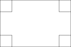
The algorithm for the size of the corner handles (handle height = bounding rectangle height / 4, CLAMPed by 6 and 50, handle width = bounding rectangle width / 4, CLAMPed by 6 and 50) allows fast interaction:
what is black in this image shall be rendered inverted on the canvas. note that at any time the marching ants of a selection edge can obscure an inverted line.
Each corner handle shall enable users to resize the bounding rectangle by dragging one of them, where the diagonally opposite corner of the bounding rectangle shall be the anchor point.
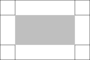
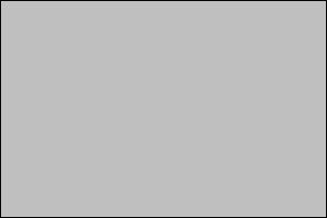
The rectangle cornered by the corner handles shall be the move handle: one big handle where users shall be able to move the bounding rectangle around the canvas by initiating a drag in this handle:
the gray area shown here is purely for illustration in this spec and shall not be rendered in GIMP
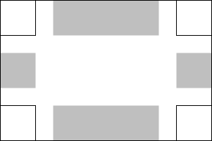
Areas between two adjacent corner handles are called side handles.
The height of the two horizontal side handles shall be exactly the corner handle height, and their width shall be the (bounding rectangle width - 3 * corner handle width), CLAMPed on the lower side by 6.
The width of the two vertical side handles shall be exactly the corner handle width, and their height shall be the (bounding rectangle height - 3 * corner handle height), CLAMPed on the lower side by 6.
All side handles shall be exactly centred on the side they are attached to. If the side of the of the bounding rectangle is an odd number of pixels long, then the attached side handle shall be an odd number of pixels long. Similarly: if even, then even. When this adjustment is needed, it shall be done by increasing the handle size by one pixel.
the gray area shown here is purely for illustration in this spec and shall not be rendered in GIMP
This all makes the size of the side handles predictable (and thus faster to use each time) where it counts most (their smallest dimension) and uses their largest dimension to leave a gap to reach the corner handles from within.
Each side handle shall enable users to resize the bounding rectangle by dragging one of them, moving the side it is attached to, where the mid-point of the opposite side of the bounding rectangle shall be the anchor point.
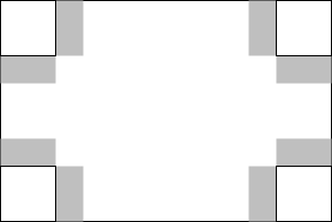
What is left within the bounding rectangle are the dead areas, a drag by users starting in these shall do nothing, neither move, nor resize. This is to prevent accidental move when trying to resize, or accidental resize when trying to move:
the gray area shown here is purely for illustration in this spec and shall not be rendered in GIMP
In the implementation the dead areas shall be used as ‘bumpers’ to reconcile the rounding-off effects in the sizes of the corner and side handles. The dead areas are simply what is left over in area of the bounding rectangle.
fixed width/height/size
When users are enforcing fixed width or height in the pending state, the rectangle handles shall reflect this. Showing corner handles does not make sense, because only two of the sides can be adjusted. Therefore these two side handles shall be displayed (fixed height, left; fixed width, right):
With no corner handles to compete with, the side handles shall occupy the whole side of the bounding rectangle. The height of the top and bottom handles and the width of the left and right handles shall be calculated as usual. The rest of the bounding rectangle area shall be the move handle:
the gray area shown here is purely for illustration in this spec and shall not be rendered in GIMP
When users are enforcing fixed size in the pending state, the rectangle handles shall reflect this. Showing corner handles does not make sense. The whole bounding rectangle area shall be one big move handle:
the gray area shown here is purely for illustration in this spec and shall not be rendered in GIMP
highlighting
When the sprite (mouse cursor) hovers over a corner handle, it shall highlight by inwardly doubling its perimeter line, and by hiding the other 3 corner handles:
When the sprite hovers over a side handle, it shall highlight along the whole side of the bounding rectangle with a 1-pixel line, to communicate that it moves the side. The other dimension of the highlight rectangle shall be that of the corresponding side handle. Also there shall be a 2-pixel line along the perimeter of the side handle itself. This is important because this is the only opportunity we have to communicate the size of the handle in a non-obstructive way. The two corner handles on the opposite side shall be hidden:
fixed width/height
As an implication of enforcing fixed width or height in the pending state, the side handles shall highlight as shown here:
rubber-banding
When the mouse goes down inside a corner handle and dragging commences, it shall be displayed and the other 3 hidden, to achieve a minimal-obstruction display:
When the mouse goes down inside a side handle and dragging commences, it shall display a rectangle along the whole side of the bounding rectangle with a 1-pixel line. The other dimension of this rectangle shall be that of the corresponding side handle. The two corner handles on the opposite side shall be hidden:
Corner handles shall not change in size during the rubber-banding of the size of the bounding rectangle. This is necessary to achieve a stable cause-and-effect relationship between the position of the sprite, and the size of the bounding rectangle.
- Side handles shall track the dimension of the bounding rectangle on the side aligned with it, while the other side shall not change in size during the rubber-banding;
- On creation of a new rectangle, the handle size shall be the minimal handle size;
- When either side of a corner handle, or the not-bounding-rectangle-aligned side of a side handle, is equal or greater that the corresponding side of the bounding rectangle, the handle shall not be displayed during rubber-banding.
cursor keys
The most important thing about enabling cursor keys for moving/resizing the bounding rectangle is that it shall be exactly the same user experience as performing the same operation with a mouse click. The only exception to this is that when resizing due to a cursor key press, the rubber-banding display shall be skipped.
- When the mouse is over one of the corner or side handles, and one of the up/down/right/left cursor keys is pressed, the rectangle shall be resized by one (shift: 15) image pixel in that direction.
- When the mouse is over the move handle, and one of the up/down/right/left cursor keys is pressed, the rectangle shall be moved by one (shift: 15) image pixel in that direction.
This interaction is not complete until the goal of keeping the sprite stable on the handle has been achieved. We depend on bug #362915 to be fixed, then we can explore feasible solutions.
think small
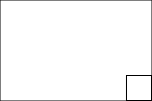
Both corner and side handles have a minimum size of 6 pixels. This will work for bounding rectangles down to a size of 18 pixels. Here we see rectangles with one and two dimensions of 18 pixels, also showing the side handles:
the gray area shown here is purely for illustration in this spec and shall not be rendered in GIMP
If the size of one of the sides of the bounding rectangle is below 18 pixels, we have a narrow situation. This can be caused by actually narrow-sized bounding rectangles, but also by zooming out and panning out of view. The obvious work-arounds for this (zoom in, pan in) are productivity eaters, we need a real solution.
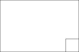
Move the handles outside. Here we see rectangles with one and two dimensions of 17 pixels:
In a narrow situation, the following specs change:
- The corner handle size shall be 15x15 pixels, always.
- If the the bounding rectangle has a non-narrow side, the long side of the side handle shall be (bounding rectangle side length - 2 * 15), CLAMPed on the lower side by 18, the short side of the side handle shall be 15 pixels.
- On the narrow sides, the size handles shall simply fill the space between the two corner handles:
the gray area shown here is purely for illustration in this spec and shall not be rendered in GIMP
There shall be only dead areas on a non-narrow side:
the gray area shown here is purely for illustration in this spec and shall not be rendered in GIMP
The move handle shall be equal to the bounding rectangle:
the gray area shown here is purely for illustration in this spec and shall not be rendered in GIMP
Highlighting is unchanged:
As is dragging:
interaction with the canvas edge
In general it shall be possible to start a crop/selection rectangle outside the canvas, or to take the edges of the bounding rectangle outside the canvas. Below is specified what happens in these cases:
selection tools
When one or more edges of the bounding rectangle is outside the canvas, then the canvas edge shall clip the effective selection. The interaction shall reflect this by showing the bounding rectangle in whatever size and position that users take it and the effective selection marching ants along the canvas edge where clipped. Especially with the elliptic select tool, this is part of creative workflow.
However:
- If users enforce a fixed ratio of the bounding rectangle and one or more edges of the bounding rectangle is outside the canvas, then all of these edges shall be aligned with the corresponding canvas edges, and the from the resulting new bounding rectangle sizes the ratio enforcement shall be calculated. The interaction shall reflect this by showing the bounding rectangle in the newly calculated position;
- If users enforce a fixed width of the bounding rectangle and the left or right edge of the bounding rectangle is outside the canvas, then this edge shall be aligned with the corresponding canvas edges, and the from the resulting new bounding rectangle sizes the width enforcement shall be calculated. The interaction shall reflect this by showing the bounding rectangle in the newly calculated position; if the fixed width is greater than the actual canvas width, then the full width of the canvas shall be used;
- If users enforce a fixed height of the bounding rectangle and the top or bottom edge of the bounding rectangle is outside the canvas, then this edge shall be aligned with the corresponding canvas edges, and the from the resulting new bounding rectangle sizes the height enforcement shall be calculated. The interaction shall reflect this by showing the bounding rectangle in the newly calculated position; if the fixed height is greater than the actual canvas height, then the full height of the canvas shall be used;
crop tool
When the 'allow growing' option has been invoked by users, then the crop tool shall be in no way limited by the canvas or layer edge. In the other case:
When one or more edges of the bounding rectangle is outside the canvas, then all of these edges shall be aligned with the corresponding canvas edges. The interaction shall reflect this by showing the bounding rectangle in the newly aligned position.
For fixed ratio/width/height: see selection tools above.
If the 'Current layer only' option has been invoked by users, then all all behaviour specified above shall apply, substituting the layer (edge) for the canvas (edge).
the fixed ratio/widht/height/size and the shift key
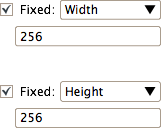
Between the 'Expand from centre' and Highlight checkbox there shall be the Fixed ratio/width/height/size control:
It is a checkbox, with (new) a pop-up list in the first row, combined with a single textfield and two icons (portrait; landscape) in the second row. The pop-up list shall contain the items 'Aspect ratio', Width, Height, Size, in that order. The default shall be 'Aspect ratio'.
The width and height modes shall not display the icons:
The size mode is most identical to the ratio mode:
textfield input
It is extremely important that the textfield shall be a single textfield with no up/down arrows. This allows for quicker input.
- in ratio mode, the textfield shall accept the formats A/B and A:B, where A and B are two floating point numbers;
- in width and height modes, the textfield shall accept a single floating point number;
- in size mode, the textfield shall accept the formats A*B, AXB and AxB, where A and B are two floating point numbers. A shall be the width, B shall be the height.
Before parsing the input, all white space characters shall be stripped out. The input shall be committed by a <return>, <enter> or a input focus change out of the textfield and shall be one of three kinds:
- unambiguous user value; User override state shall be entered for this particular mode (ratio, size, etc.) for all images, for the rest of the session; the user entered value shall be used for this mode;
- unambiguous user clear; apart from that stripped out white space, nothing else was entered in the textfield; this shall enter the default state for this particular mode (ratio, size, etc.) for all images, for the rest of the session; the default value shall be displayed and used for this mode;
- anything else is ambiguous; no state or value change shall be undertaken; the value displayed before users' text input shall be restored.
Default values:
- in ratio mode, the default value for the textfield shall be "1:1" for the selection tools; for the crop tool it shall be <current layer/canvas width>:<current layer/canvas height> when there is no pending crop rectangle and <crop rectangle width >:<crop rectangle height> when there is a pending crop rectangle; this value shall not change during rubber-banding;
- in width mode, the default value for the textfield shall be <current layer/canvas width>;
- in height mode, the default value for the textfield shall be <current layer/canvas height>;
- in size mode, the default value for the textfield shall be "100x100", [this is a random value, I am open for suggestions for a more useful default here].
mathematician's Easter egg
In ratio mode, when the users' input is terminated with a '=' character, the entered ratio shall be simplified to the to lowest integer numbers that faithfully represent the ratio. The '=' character shall not be displayed after siplification. Both the entered ratio and the resulting simplified ratio shall be added as user input for auto-completion.
auto-completion
The textfield shall have auto-completion, Firefox URL-field style. In ratio mode, '/' and ':' shall be treated as fully equivalent. In size mode, '*', 'x' and 'X' shall be treated as fully equivalent. That means that is one is typed, it shall match any other in the previous user input. Only unambiguous user input shall be stored for auto completion re-use for the particular mode. It shall be persisted for a week after being entered or being re-used.
checkbox and the shift key
When the checkbox is checked, the constraint that is set by the user with the ratio/width/height/size pop-up list shall be enforced while rubber-banding a rectangle. Pressing the shift key while rubber-banding shall toggle the checkbox in the other state. Only users shall be able to explicitly toggle the checkbox directly or with the shift key. Under no circumstance shall GIMP itself get smart and toggle the checkbox, particularly not as a result of users entering or clearing text in the textbox.
The two icons shall be just icons, not inside pushbuttons like in the New file dialog. No state shall be reflected by the icons. this just leads to unnecessary noise in the interface. Clicking one of the icons shall simply enforce portrait or landscape in the textfield by swapping the two number values when necessary.
tool options
From all three tool option panels, all the Fix buttons shall be removed.
The Width field shall be greyed-out when either fixed width or fixed size is enforced by the user. The Height field shall be greyed-out when either fixed height or fixed size is enforced by the user.
All lines that contain textfields shall be sized such that they just fit inside a tool option panel that is 6 tool icons wide (the default).
The guides pop-up menu left side shall be aligned with the left sides of the checkboxes, the pop-up menu right side shall be aligned with the left sides of the textfields.
For the crop tool there shall be a new checkbox in the options panel: 'allow growing' (default: unchecked). Normally limiting cropping to the exact edges of the layer/canvas has the highest priority, hence the rules above. This checkbox overrides that, and the layer/canvas can be size up by dragging a bigger rectangle around it.
highlight/darkening of the crop tool
Even when the Highlight checkbox is checked, the darkening effect shall not be displayed during rubber-banding. This allows for precise adjustments.
