Tool Options widgets
Contents
Tool Option widgets
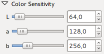
All UI elements are built from a few basic UI building blocks called widgets. A list with images of all current available GTK+ 2 widgets can be found at [1] and their respective GTK+ 3 counterparts at [2]. Since GIMP has special needs it also has quite a few widgets of it's own, a number of them (the external accessible ones) can be found at [3]. GIMP also has a number of additional internally used widgets, quite a few just extend basic GTK+ widgets for a specific need, without altering the visual look and feel. However, there are also completely new widgets for specific needs like those used for pressure curves or the gimpspinscale, a mix of a spin and scale button that is now used by a lot of tool options. A third category are meta widgets that mix together a few basic widgets in a certain fashion for a particular purpose, an example is the gimpscaleentry which consists of a label, scale slider and spinbutton (look at Tools->Color Tools->Brightness-Contrast menu).
An exhaustive list of widgets is unneeded as most tool options only use a basic subset of aforementioned widgets, the following table is a list of those common widgets used in tool options and their GIMP counterparts if applicable.
| GTK+ | GIMP |
|---|---|
| GtkLabel | |
| GtkComboBox | Gimp{Int,Unit,Sttring,ColorProfile,Enum}ComboBox |
| GtkButton | Gimp{,Chain,Pick,Color}Button |
| GtkSpinButton | |
| GimpSpinScale | |
| GtkExpander | |
| GtkEntry | |
| GtkToggleButton | |
| GtkScale | |
| GtkRadioButton | |
| GtkCheckButton | |
| GimpFrame |
Available widgets
A non-exhaustive list of widgets that exist in GTK+ and GIMP today. Specific widgets that are not immediately useful in the context of tool options are left out. Italic descriptions come from the GNOME Human Interface Guidelines [4], an excellent resource for sensible use of said widgets.
GtkLabel
| |
Widget to display small to medium amount of text.
- can be selectable
- can be ellipsized
GtkComboBox
| |
Widget used to choose from a list of items
- can have textentry
- relevant GIMP specific subclasses
- GimpUnitComboBox
a convience combobox for measurement units
- GimpUnitComboBox
Drop-down lists are used to select from a mutually exclusive set of options. They can be useful when there is insufficient space in a window to use a group of radio buttons or a single-selection list, with which they are functionally equivalent.[5]
Drop-down combination boxes combine a text entry field and a drop-down list of pre-defined values. Selecting one of the pre-defined values sets the entry field to that value.[6]
GtkButton
| |
Widget that creates a signal when clicked on.
- can have image and/or text
- relevant GIMP specific subclasses
- GimpButton
adds click modifier keys - GimpChainButton
button for (un)chain action used in conjunction with other widgets
- GimpButton
A button initiates an action when the user clicks it.[7]
GtkToggleButton
| |
Similar to GtkButton, but retains state.
Toggle buttons look similar to regular Buttons, but are used to show or change a state rather than initiate an action. A toggle button's two states, set and unset, are shown by its appearing "pushed in" or "popped out" respectively.[8]
GtkLinkButton
| |
A GtkLinkButton is a GtkButton with a hyperlink, similar to the one used by web browsers, which triggers an action when clicked. It is useful to show quick links to resources.
GtkSpinButton
| |
Widget to retrieve number from user.
A spin box is a text box that accepts a range of values. It incorporates two arrow buttons that allow the user to increase or decrease the current value by a fixed amount.[9]
GtkEntry
| |
Widget for single line keyboard entry.
- relevant GIMP specific subclass
- GimpNumberPair
entry widget for ratios
- GimpNumberPair
Text entry fields are used for entering one or more lines of plain text.[10]
GtkScale
| |
Slider widget to select value from a range.
A slider allows the user to quickly select a value from a fixed, ordered range, or to increase or decrease the current value[11]
GtkRadioButton
| |
Widget to select one from a multiplechoice options list.
- In tool options sometimes used to hide widgets like a GtkExpander
Radio buttons are used in groups to select from a mutually exclusive set of options. Only one radio button within a group may be set at any one time. As with check boxes, do not use radio buttons to initiate actions.[12]
GtkCheckButton
| |
Discrete toggle button.
Check boxes are used to show or change a setting. Its two states, set and unset, are shown by the presence or absence of a checkmark in the labelled box.[13]
GtkExpander

|
| |
Widget to show or hide a widget container.
GimpSpinScale
| |
A mixture of scale and spin button in one.
GimpFrame

|
GNOME HIG compliant frame [14].
Reoccuring tool options
Some sets of widgets reoccur several times in the different tool option menus. It might be practical to keep these in mind when redesigning. The most common of these sets are listed below.
| |
Mode selection for selection tools, works as radiobutton-type group.

|
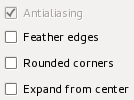
A set of options for selection tools.

|
Mode selection for paint tools.

|
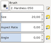
Brush selection for paint tools.

|
Dynamics selection for paint tools.
| |
|
|

|
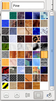
Specialist buttons for selecting brush/gradient/pattern. Pattern selection shown expanded as example.
Math in entry widgets
Entry widgets now allow for simple math formula's as input, including GIMP specified unit arithmetic.
Enhancements have also been made to the size entry widget, which is used for inputting most of the x, y, width, height parameters. For example, in the scale dialog it is now possible to write '50%' in the Width field to scale the image to 50% of the width. Expressions such as '30in + 40px' and '4 * 5.4in' work, too.
- GIMP 2.8 release notes[15]
[end]