Software Icon workgroup
Feature request: https://bugzilla.gnome.org/show_bug.cgi?id=707932
Contents
Summary
Current GIMP provides the "Wilber" icon to the underlying desktop when there are no image, and a thumbnail of the opened image otherwise. This icon is normally used in a task bar, through alt-tab or other means provided by a given desktop to retrieve open programs.
Original Design
This feature has likely been created for easily retrieve a GIMP image window, especially when several are being used.
Raised Issues
The following issues have been raised:
- When a user opens a lot of non-GIMP windows, it makes it hard to retrieve the GIMP windows, whereas the Wilber icon is a consistent and known way of identifying GIMP immediately.
- The thumbnail-icon is anyway so small that it is not quite sure how much of a "retrieval" interest it has, even with many images opened in GIMP (which goes against even the original goal).
- The thumbnail icon can end up a distorted version of the origin image (which would rarely have the same aspect ratio), which makes it quite ugly. This happens for instance in KDE which seems to force icons to some square format.
- The image changing often (hence the thumbnail), it creates no consistent reference in the user memory, who therefore always have to search GIMP windows.
Study of Common Nowaydays desktops
GNOME 3
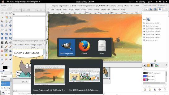
Alt-tab in GNOME-3 (v. 3.16.2) with images opened in GIMP (multi-windows mode):
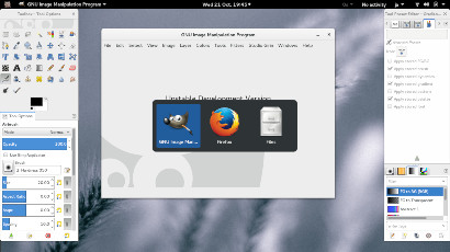
Alt-tab in GNOME-3 with no images opened in GIMP (multi-windows mode):
GNOME 3 does not use the generated icon by default and always use the software Wilber icon. Moreover it will display both in Alt-Tab and in the activities mode its own Thumbnail of the whole GIMP windows, in bigger size than our thumbnail-icon (hence more visible) and keeping the correct aspect ratio.
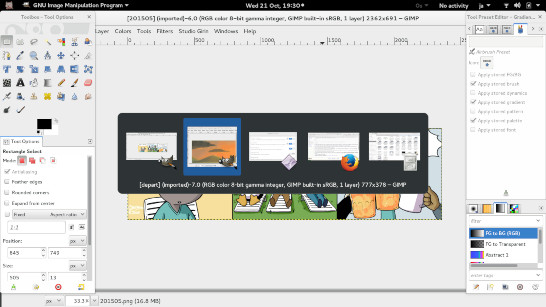
Alternative alt-tab in GNOME-3 and the AlternateTab plugin, with images opened in GIMP (multi-windows mode):
There exists various plugins to change behavior of GNOME, thus in some case the generated thumbnail-icon may appear.
Cinammon
Cinammon uses the same system as GNOME 3 for alt-tab (probably even sharing code).
KDE
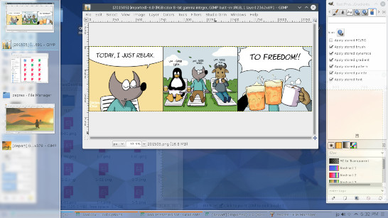
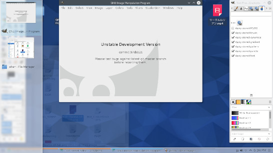
Alt-tab in KDE Plasma (v. 5.4.1) with images opened in GIMP (multi-windows mode):
Alt-tab in KDE Plasma with no images opened in GIMP (multi-windows mode):
Screenshot showing that thumbnails are also used as icons in the taskbar (not sure why my own tests were not showing these):
KDE Plasma has a similar behavior to GNOME 3, showing its own bigger thumbnails with the right ratio, except that it also use GIMP's generated thumbnail-icons. One can also notice in the above screenshots how distorted and ugly they end up.
OpenBox ("raw" i.e. without desktop)
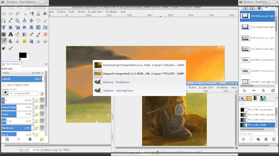
Alt-Tab in Openbox (3.6.3) with images opened in GIMP (multi-windows mode):
OpenBox shows the thumbnails and keep the right ratio. One can also notice that it shows every windows, even toolbox and docks (oppositely to GNOME or KDE for instance who have a concept of main windows and don't display anymore docks/toolbox by default). So thumbnails can be good to distinguish the image windows here. Though with many third-party windows opened, it may oppositely become a problem to find these.
XFCE
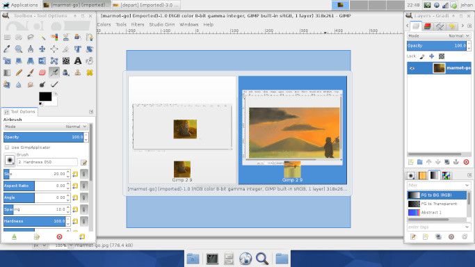
Alt-tab in XFCE (4.12.1) with images opened in GIMP (multi-windows mode):
One can notice the taskbar uses the generated thumbnail-icons (only case up to now amongst all tests or feedbacks). The alt-tab also uses the thumbnail-icon (distorted too), which is redundant with its own thumbnailing.
Windows
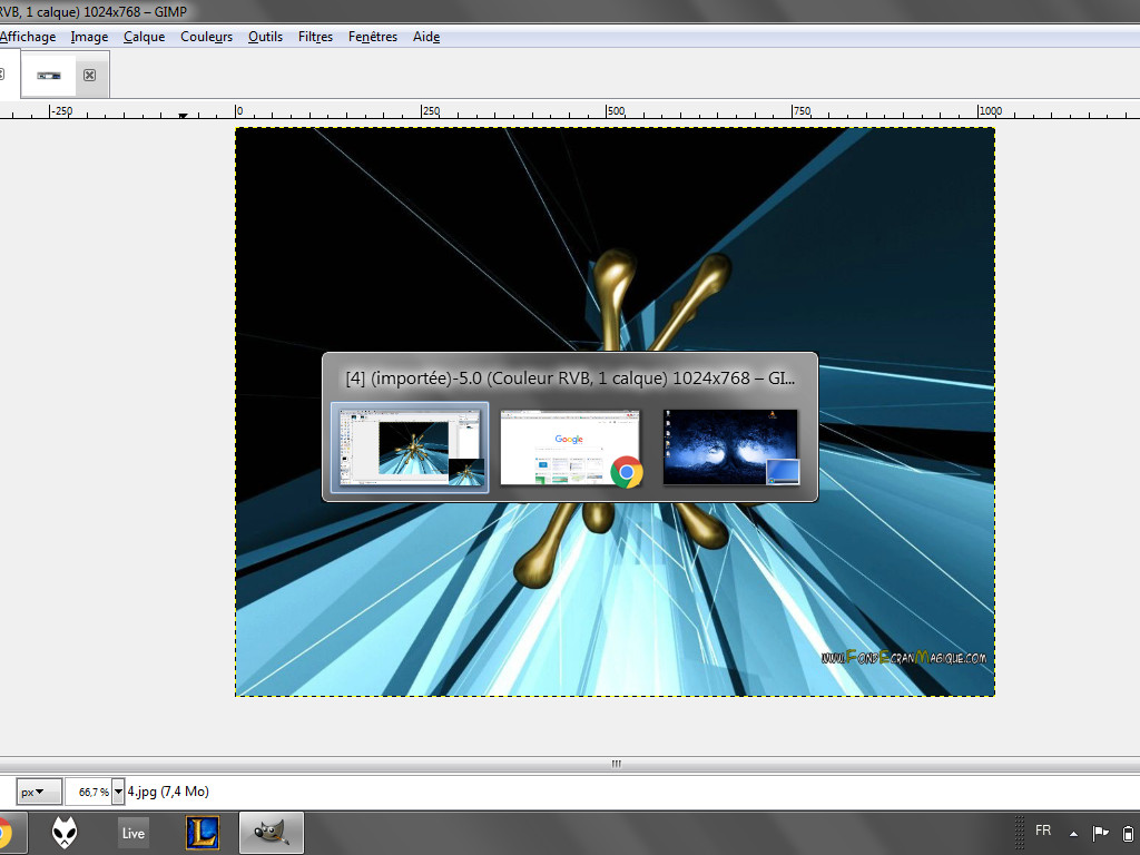
Alt-Tab in Windows 7, single window mode:
The icon is the generated thumbnail-icon. We can easily see how it makes GIMP hardly recognizable. One can also notice that Windows generate its own thumbnail, which is already bigger than our icon. The icon in the task bar on the other hand is always Wilber (though the reporter of the bug said it was also the thumbnail, on Win 7 as well. Maybe this depends on subversion?).
OSX
Patrick David says: "In OSX Yosemite, wilber is shown when alt-tabbing or on the dock (even in multi-window mode)."
Results
The above study is not finished, but what we can already see is that desktops probably have evolved a lot since the feature first appeared. The first remark is that most modern desktops seem to offer their own thumbnails of software windows, in particular in bigger size than what an "icon" would provide, hence much more visible and useful than a thumbnail-icon. Considering this, proposing our own thumbnail-icon seems redundant and trying to do the desktop job.
The second point is that all people up to now who expressed their opinion clearly agreed that the Wilber icon only should be displayed in single-window mode at least, "where the visual will refer to a 'session' of GIMP (ie: single-window mode or grouping as mentioned in GNOME 3". And all seem agreed that showing a thumbnail often proved annoying to distinguish GIMP windows in a glimpse.
It has been proposed that maybe it could still be useful in multi-windows mode "for identification of particular image windows". Yet no user of multi-windows mode has given an opinion yet so this proposition is only theoretical. We are not sure this would be actually useful (rather than annoying) to Multi-Windows mode users too, especially considering the study of modern desktop above.
Another proposition would be that even if we were to generate a thumbnail, there should be a Wilber-icon above it (similar to the thumbnail+icon generated in GNOME 3 with "AlternateTab" plugin). Yet considering the size of such a thumbnail-icon, it would probably render quite ugly and likely not as identifiable as a straight Wilber icon.
