Work in progress on windows layouts
Problem statement
We've been carrying more or less the same default layout of GIMP's main window for well over a decade. However, we now ship GIMP with tools grouped by default, which begs for reviewing the layout.
Moreover, there have been multiple requests to introduce workflow-specific named layouts finetuned for commons tasks like digital painting, digital photography etc. with an ability to create your own named layouts.
Raw initial data from users
To collect initial data, we asked users on social media to submit customized window layouts and explain 1) what is their main usecase for GIMP, 2) why they customized the layout like that.
Resulted submissions (however few) can be categorized as follows:
- General editing
- Layer compositions
- Graphic design
- Drawing and painting
- Photography
- Web design
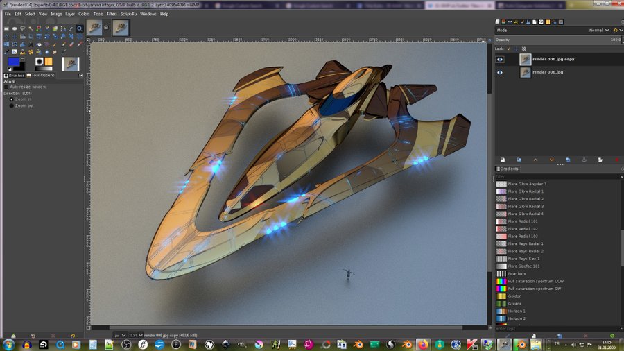
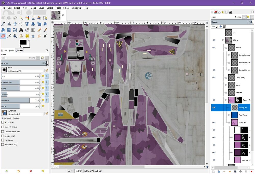
- 3D-related: texturing, UV etc.
Below is the gallery. Please note that while all users named primary tasks, not everyone submitted more information than that.
General editing
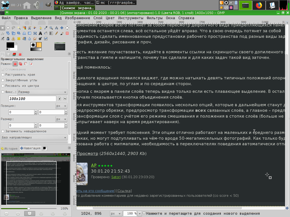
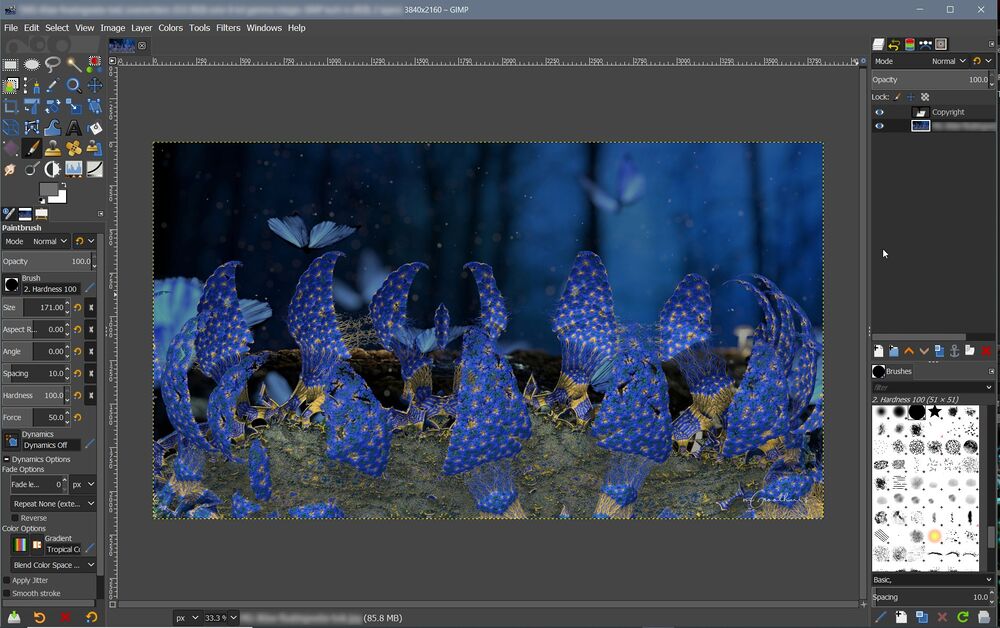
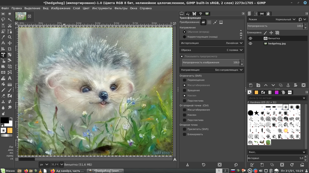
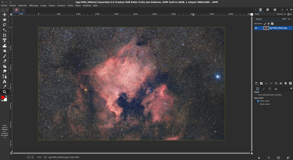
User kirill_rrr: "I only do very basic and general editing, I don't need much from GIMP".
User Brian00298905: "Image manipulation."
Layer compositions
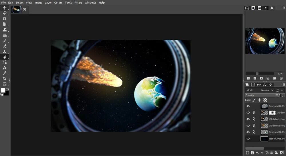
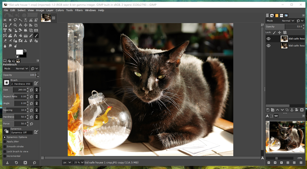
User 82pixels_de: "This is mine, it actually looks like yours. I arranged everything like in Photoshop almost so the transition was easier. What I would like in Gimp to have an option like in the Blender splash screen where you can chose between program keybinds in Gimp for example Photoshop."
User adderbox76: "Nothing too crazy. Most important thing for me was having a free floating dock for my most commonly used tools that I can drag around the canvas without using "multi-window mode", and making as much as possible available in tabs rather than menus."
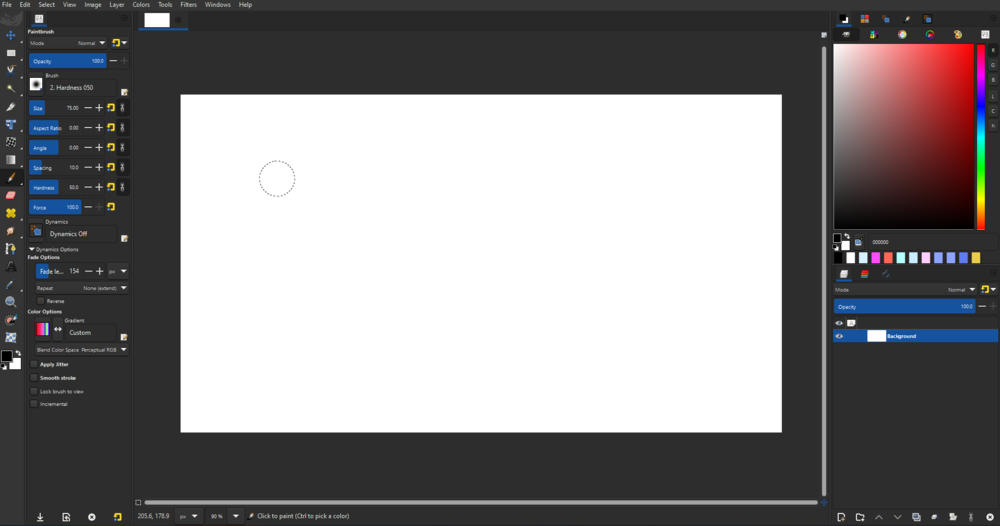
User pix_cores: "I've been experimenting around with Gimp's layout for a few months now. I was also working to identify which layout is ideal for both new and existing users.
Why do I think it is a great layout for Gimp? The first thing is the vertical toolbox. The Verticle toolbox makes the UI look cleaner and more organized. The main reason is familiarity. Inkscape, Blender, and Krita are some other software usage verticle toolboxes. This means that many people who are just getting started with Gimp will immediately understand how it works and will recognise the similarities between the programs. This will help make Gimp less intimidating to new users as well as people transitioning from other software.
Second is tool options. I've shifted the tool options to the toolbox's side. You often have to scroll through tool options to get to the entire tool settings, therefore putting tool options on a separate panel will address this problem.
Another reason is the amount of time it takes to travel. Because the first thing we do after picking a tool is modify its settings, having tool options next to the tool box is beneficial to usability and efficiency. Also, while this would not make a significant difference for existing Gimp users, it would be great for new users.
The right side of the layout will be the same as before, with a few minor changes."
Graphic design
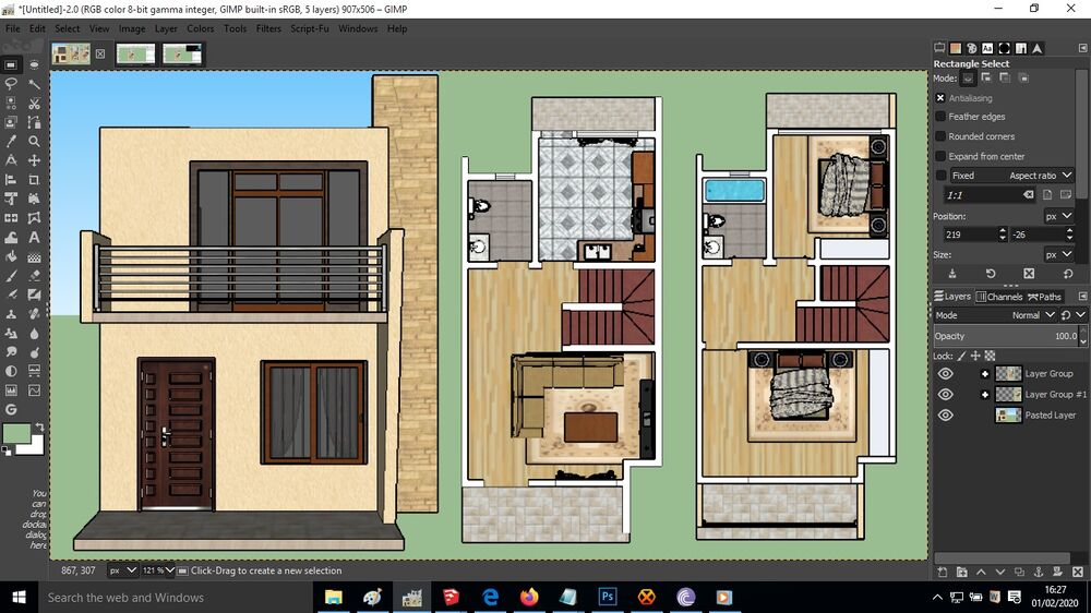
User BupeJoseph: "This is my common setup. I use GIMP for touching up my architectural design projects, and that includes texturing, lighting and documentation. My workflow often need enough working space, but thanks to Ell for the show-all and now the grouped tools 🙏👏"
Drawing and painting
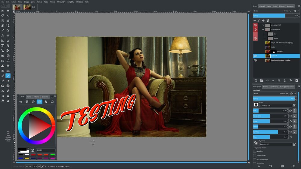
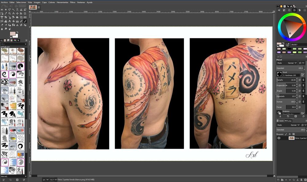
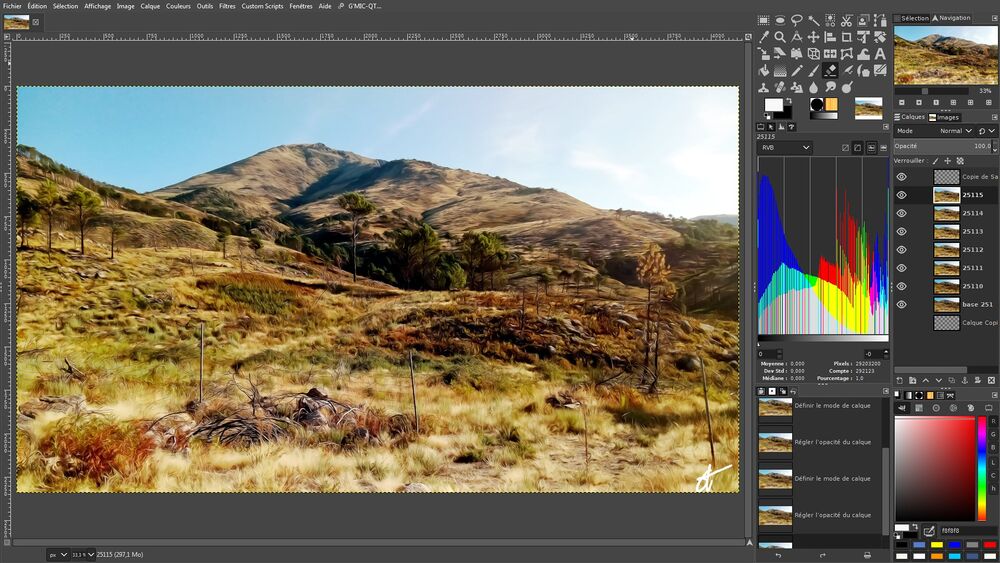
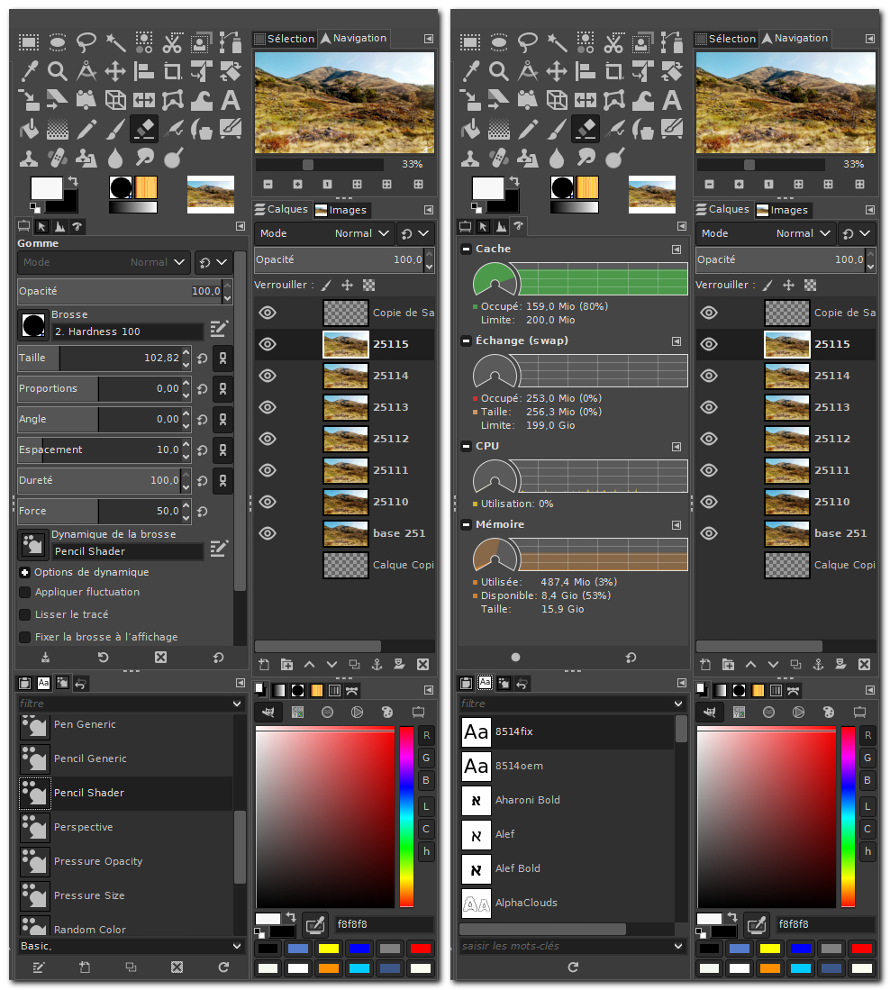
User Axl Gómez Tagle Islas: "I always have on the right side, the color ranges to make quick changes in retouching or when I draw, I also have the Tool Options to make changes easily on the thicknesses and intensities of the brushes, and even the Layers down because they are used a lot when I'm Making a new design. From the left side to the top I have the default menu of all the tools and below the My Paint brushes because it lets me choose more easily which pencil or brush I want to use"
User Richard Kramenstetter:
User ToxictheMutt:
Photography
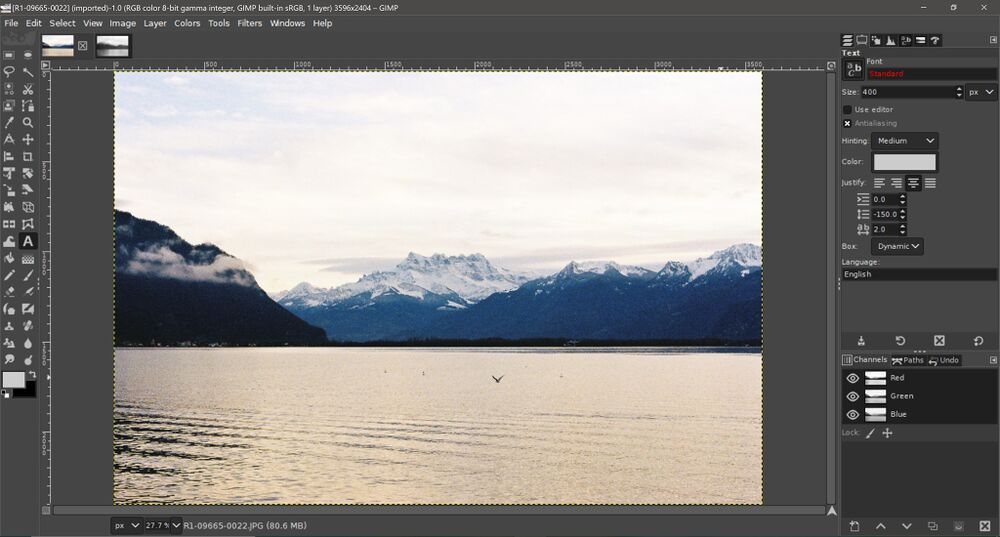
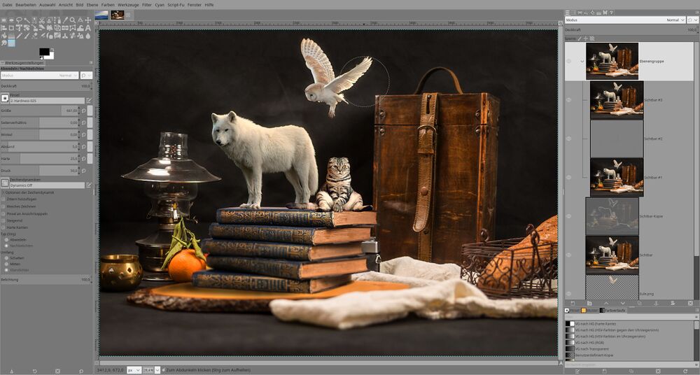
User Marijke.jpg: "Primary use cases — photo editing and manipulation. Tools and options on the left because I use these less than what I have placed on the right. Layers, for me, are at the top because I work a lot with them and Blend Modes. I feel this layout works best for a right-handed person like me. (Brushes are there because I use a lot of different ones for masking work)."
User Stijn: "Just basic photo retouching and curves adjustment. Use layers quite a bit for colour correction, and wavelet decompose to remove blemishes."
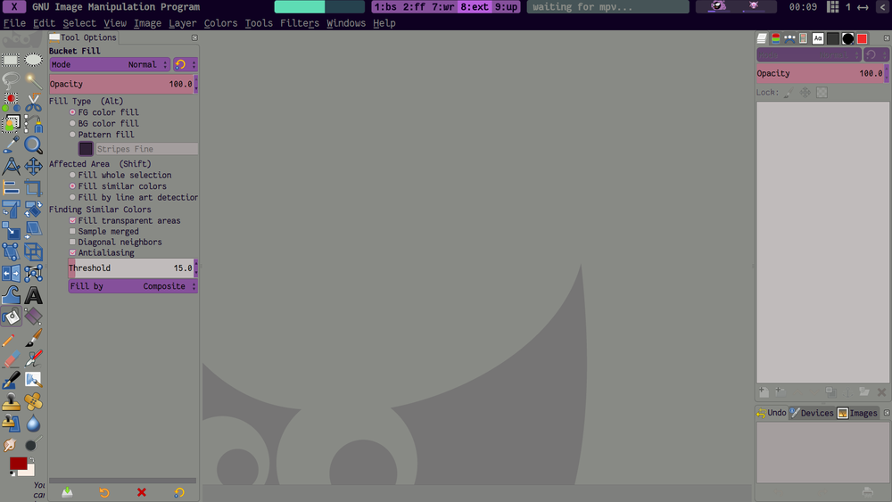
User actionless: "When I use GIMP on a laptop, I move the tool settings dock to the left, otherwise there's not enough vertical space, and I have to scroll up and down a lot. I use GIMP for all sorts of tasks, from designing tiled patterns for wallpapers to photo retouching. My custom layout works for all of those use cases."
User grem: "Used to do mostly quick retouching of photos, now mostly composite multiple photos."
User SkyMaverick: "I mostly do all sorts of "quick desktop publishing stuff" (postcards, business cards, book covers, certificates etc.), photo restoration, b/w photo colorization etc. I also do passport photos and simplistic photo retouching. I don't switch between tools all the time, I mostly tweak settings of the current tool. Tool's settings dock is large, so I keep it a almost screen's height. The rest is equally separated between what I paint on (layers, channels) and what I paint with (brushes, color swatches etc.). Pretty much most of the time I have tool settings, layers and brushes open."
User Acmespaceship: "I keep three windows visible all the time: Tool Options, Layers and Navigation.
The new suggested default layout makes more space for the image which is good, but it’s not so convenient to place Tool Options on the opposite side of the screen from tool selection. It’s rare for me to select a tool without adjusting the options and that’s a lot of mousing back and forth across the screen.
Still, the new idea looks nice and it might be a good default for new users.
What about stacking the tools at the far left as suggested, and then moving the other dockable windows just to the right of the tools? In other words, putting all the controls on the left and the image on the right? With an option that makes it easy for users to flip the layout and put controls on the right."
User s7habo:
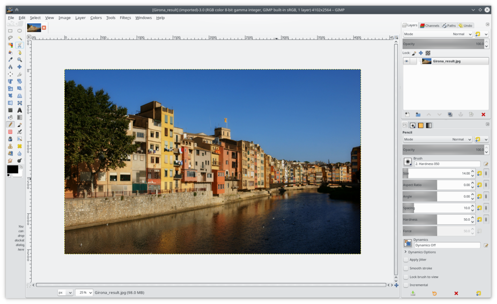
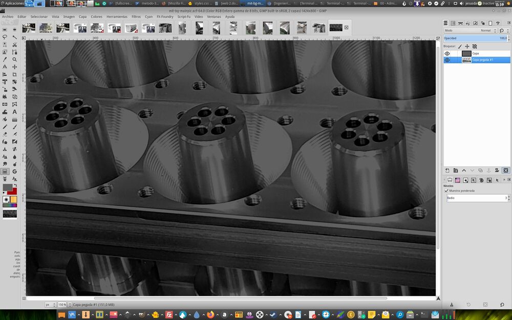
User jesusda: "This is my default #gimp layout, mainly used for photo retouching as I am web designer. Very similar to your purpose but putting layer tap on top of the config tab."
User Cyril:
User StillFunk: "This is mine, nothing special i think, depending what i work on i switch to different tabs in the various modules as seen on the 2nd screen."
Web design
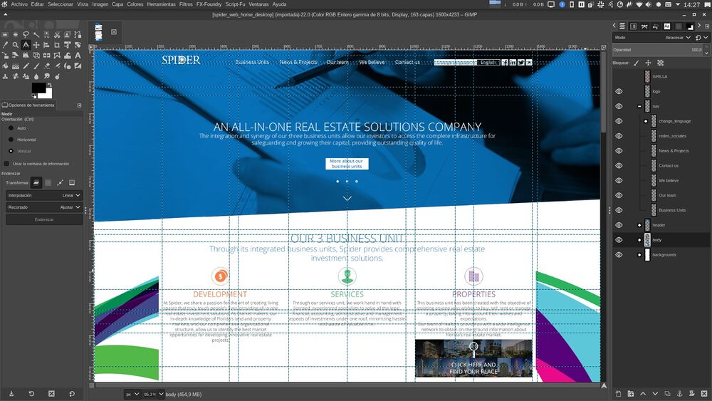
User fenavente:
User MetSender: "Nothing fancy here... Although I would like to get my tool set vertical and be able to lock my canvas rotate function. And yes, I did forget to thank all whom did make this great version of GIMP possible. Thank you kindly, Mehmet.
Gimp practically is my first reach tool for all 2D applications. I do combine gimp with blender's cycles renders. Thank you."
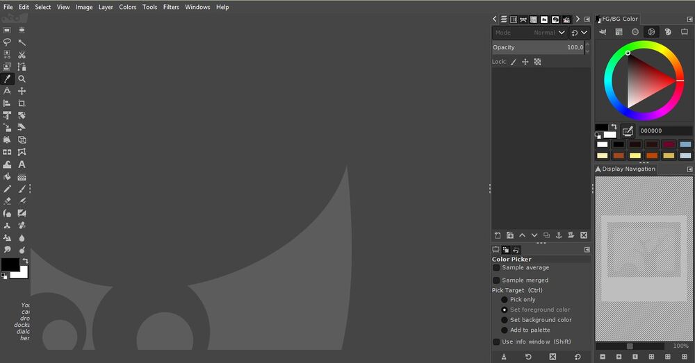
User SuperOstrich: "Texture work mostly. My config is pretty close to the defaults, old habits die hard. "
Analysis of raw data
Overall notes
There have been 22 submissions so far.
Position of the toolbox with regards to the tool's settings dialog:
- 10 have just the toolbox on the left
- 7 have tool settings below the toolbox
- 2 have tool settings to the right from toolbox (that is on the left)
- 1 doesn't have the toolbox at all
- 1 moved the toolbox to the right and rearranged the layout completely, with tools settings in the next column
Icon themes:
- 15 have greyscale symbolic theme
- 7 have colorful theme
Generalized layouts per category
General editing
TO BE DONE
Layer compositions
TO BE DONE
Graphic design
TO BE DONE
Drawing and painting
TO BE DONE
Photography
TO BE DONE
Web design
TO BE DONE
TO BE DONE
Proposal
TO BE DONE
