Work in progress on slider redesign
This WIP page focuses on issues users have with the current implementation of sliders used in tools' and filters' options, researches alternative implementations, and suggests redesign options.
Current design rationale
The current implementation of sliders was designed to solve a problem of single-rate linear sliders when making small adjustments down low, like changing from a 5-pixel brush to a 7-pixel brush.
The solution was to separate the slider area vertically into two parts:
- Upper part: uses default increment rate, supports the click-to-set-new-value interaction, supports mouse wheel incrementing at the default increment rate.
- Lower part: uses a smaller increment rate, doesn't support the click-to-set-new-value interaction, supports mouse wheel incrementing at a smaller increment rate.
Numeric input was merged into the slider area, at the right side.
Increment buttons, operating with default increment rate, were preserved and put to the right of the slider area.
Issues
Executive summary: the current implementation of the slider is not obvious, makes numeric input difficult, and takes too much space on the screen.
Common issues with the current sliders as pointed out by users online:
- The split of the slider area for small/large changes separation is not obvious. People only figure it out when specifically told about it.
- Numeric input is too difficult to use. The area is inside the slider, so it clashes with the slider. It's also very small, hence changing the value completely (e.g. from 123.7 to 300) means having to make a very fine hand movement to select all of the digits, then press Del, then input new digits.
- The widget occupies twice the size of the vertical space of slider widgets found in most other applications because it has to provide a high enough area for both the 'fine adjustments" and the 'large adjustments' parts of the slider to make the widget usable at all. This means users see a lot fewer controls on the screen and have to scroll for more.
Types of interaction
Sliders generally support several types of interaction.
Incrementing by dragging left and right
There are generally three subtypes:
- Default incrementing. Uses default increment rate, default input device sensitivity, no constraints.
- Incrementing with lowered sensitivity of input device to slow it down and thus allow making smaller increments using same force.
- Constrained incrementing. Uses a step of X units or X power of default increment rate to allow making faster increments (e.g. increment opacity by 10% for each change until it reaches either 0 or 100).
Incrementing by mouse wheel
Typically uses default increment rate.
Incrementing by buttons
Typically uses default increment rate.
Setting new value by clicking in the respective position
Allows quickly setting a value that's just about right, but might need some tweaking.
Numeric input
Allows setting precise value.
Existing implementations
This section allows to discover what kind of interaction might be typically expected by users with prior experience of using 'artistic' applications that rely on sliders for controlling values.
Executive summary
Is there a single most common implementation people expect?
Is GIMP's current implementation matched by any other application?
As far as we can tell, not. In fact, Inkscape developers, who reused our slider widget, specifically got rid of the horizontal separation and introduced key modifiers instead.
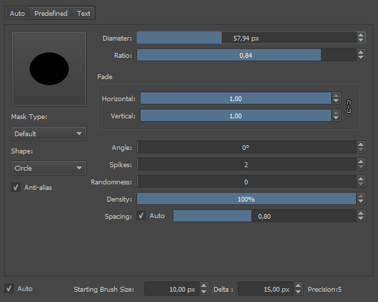
Krita
Drag = default increment
Shift + Drag = smaller increment
Constraints = none
Click to set to position = yes, right-click
Mouse wheel = yes, default increment rate
Numeric input = yes, right-click
Increment buttons = yes, to the right of the slider
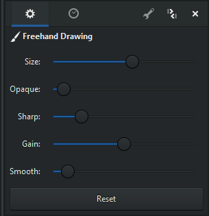
MyPaint
Drag = default increment
Shift + Drag = smaller increment
Click to set to position = yes
Mouse wheel = yes, default increment rate
Increment buttons = none
Constraints = none
Numeric input = none (value only displayed in the advanced brush settings dialog, not editable)
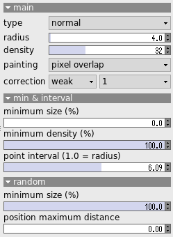
AzPainter
Drag = default increment
Ctrl + Drag = smaller increment
Click to set to position = yes
Mouse wheel = no
Numeric input = no
Increment buttons = yes, to the right of the entry field
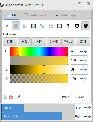
Inkscape
Drag = default increment
Alt + Drag = smaller increment
Ctrl + Drag = Constraint to a step of 10
Click to set to position = yes
Mouse wheel = yes, smaller increment rate
Numeric input = yes, by editing an entry field next to the slider
Increment buttons = yes, to the right of the entry field
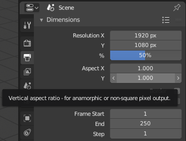
Blender
The label is to the left of the slider, outside.
Drag = default increment
Ctrl + Drag = constraint to a large step
Shift + Drag = smaller increment
Click to set to position = no, enables numeric input instead
Numeric input = yes, by single/double-clicking inside the slider, autoselects all digits
Mouse wheel = yes, default increment, only with Ctrl modifier
Increment buttons = yes, to the left (decrease) and to the right (increase), visible only on hover (not always available though)
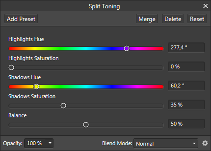
Affinity Photo
Drag = default increment
Alt / Ctrl / Shift + Drag = smaller increment
Click to set value = yes
Numeric input = clicking on the field autoselects all digits
Increment buttons = no
Mouse wheel = yes, default increment, only above numeric input fields
The modifier works only in some dialogs (e.g. yes for Split Toning, no for advanced brush settings). Maybe a bug?
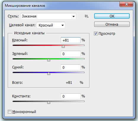
Adobe Photoshop (CS6)
Drag = default increment
Alt / Ctrl / Shift + Drag = doesn't do anything
Click to set value = yes
Numeric input = clicking on the field place the cursor next to the value (no autoselection)
Increment buttons = no
Mouse wheel = yes, default increment
Shift + Mouse wheel = constraint to 10 (at least, in some use cases)
For some use cases (e.g. Gaussian blur), Photoshop seems to divide the slider into two parts where increment gets increased towards the end.
Kdenlive
While Ardour is a non-linear video editor, it extensively uses sliders to control effects.
Ardour
While Ardour is a digital audio workstation rather than a graphics app, it extensively uses sliders, especially when rendering host UI for plug-ins (instead of native plugins UI where applicable).
[end]